Leading from this idea, photographers and directors often diverse these roles and experiment to create scenes with high-key and low-key lighting. High-key lighting possess a high range of white and bright colours, containing minimal blacks or mid-tones. Low-key lighting however possess shadows, deep blacks and contrast - the opposite of high-key.
I experimented a numerous variety of techniques and experimented with positioning of the light in the videos embedded below.
Edge Lighting:
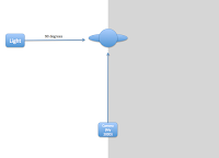 In terms of lighting, edge lighting which uses a hard light to cast shadows upon the subject, commonly used upon the face where half of the face is blacked out by shadow. I demonstrated this in the studio, by positioning my light at a 90 degree angle - to the left of my subject, this caused a harsh contrast with shadows across the right side of her face. This technique is often used to allow the audience to take a mysterious reading of the character/subject and to question significance. I feel in my example this came across well.
I also tried to experiment with natural lighting, although the technique was demonstrated well. I realised that the camera was not in focus of the subject, it is important I balance and focus on all elements of cinematography equally in the future, so I do not make this mistake again - such as a checklist for future reference etc.
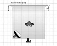
Rembrandt:
Rembrandt lighting is often used in portraiture, it creates a natural looking setting whilst also creating a triangle like shape on the face, ultimately originating from Rembrandt Harmazsoon van Rijn, a dutch painter who used these triangle like shapes in his painings between the nose and the under-eye. I demonstrated this in the studio, following the diagram attached on the right - keeping the light between 25 and 45 degrees from the camera. It is also worth noting that it is worth using a reflector as it helps preserve the detail in the face that may be lost without. Overall I found following this technique difficult as the positioning of the light source has to be precise; but it was achievable and I am happy with how the image turned out.
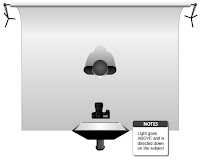
Butterfly:
Butterfly lighting is often used in portraiture, it is where the camera is place directly above and centre to the subject, the name originates from the technique creating a butterfly shaped shadow below the nose. I demonstrated this following the diagram to the left. I feel the outcome was okay, however the shadows were not completely visable and on reflection, I think this is because of where I positioned my light as it was not high enough, I will consider positoning of the subject lower to justify this in future.
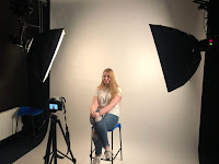
Experimentation with lights in the studio:
I wanted to see what it would look like visually if I positioned two studio lights to either side of the face, I was aiming to create a shadow in the nose area. I did this on a white backdrop and directed the camera facing the subject. This turned out okay, however, I feel the effect wasn't created despite the lamp level being on the lowest setting on both lights. If I were to use this method in the future, I would either try it on the highest settings, to see if that creates the contrast I would like or have the subject place behind a black background.
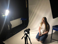
I also used an LED light with Barn-doors to create partial lighting without any other lighting source available, I attempted to use fingers also to try and create some shadows. This didn't turn out as successful. I feel that part of the reason for this is due to the lack of shadows being created with the light (which is later justified+5 seconds into the video). Doing this again, I would experiment with more probs to create shadow, such as gobos (GOes Before OpticS).
Low-key lighting:
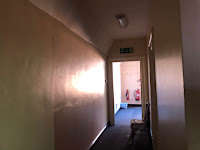 With lowkey lighting, I knew that contrast would be important. I therefore chose to shoot indoors with little artificial/natural light source, I found that a dark corridor was best in this situation as the little natural light that seeped through the windows offered a perfect base for shadow. I then developed my ideas and decided to try silhouettes, with the subject blocking the light. I positioned the subject with her back facing the camera as I wanted to create a quick clip from a horror movie, where a character sees a silhouette of a person, and walks up to it. I feel when filming this, this turned out okay, however there were improvements that could have been made; an example being that I forgot to use a tripod which caused the video to be a little shaky. I could have also experimented with led's to create a more defined shadow.
No comments:
Post a Comment